CupertinoCheckbox
A macOS style checkbox.
Checkbox allows to select one or more items from a group, or switch between two mutually exclusive options (checked or unchecked, on or off).
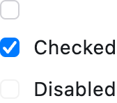
Basic CupertinoCheckboxes
Inherits: LayoutControl
Properties
-
active_color(ColorValue | None) –The color used to fill checkbox when it is checked/selected.
-
autofocus(bool) –Whether this checkbox will be selected as the initial focus. If there is more than one control on a page with autofocus set, then the first one added to the page will get focus.
-
border_side(ControlStateValue[BorderSide] | None) –Defines the checkbox's border sides in all or specific
ControlStatestates. -
check_color(ColorValue | None) –The color to use for the check icon when this checkbox is checked.
-
fill_color(ControlStateValue[ColorValue] | None) –The color used to fill this checkbox in all or specific
ControlState -
focus_color(ColorValue | None) –The color used for this checkbox's border shadow when it has the input focus.
-
label(str | None) –A clickable label to display on the right of this checkbox.
-
label_position(LabelPosition) –Defines on which side of this checkbox the
labelshould be shown. -
mouse_cursor(MouseCursor | None) –The cursor for a mouse pointer entering or hovering over this checkbox.
-
semantics_label(str | None) –The semantic label for this checkbox that will be announced by screen readers.
-
shape(OutlinedBorder | None) –The shape of this checkbox.
-
spacing(Number | None) –The space between this checkbox and the
label. -
tristate(bool) –If
True, this checkbox'svaluecan beTrue,False, orNone. -
value(bool | None) –The value of this checkbox.
Events
-
on_blur(ControlEventHandler[CupertinoCheckbox] | None) –Called when this checkbox has lost focus.
-
on_change(ControlEventHandler[CupertinoCheckbox] | None) –Called when the state of this checkbox is changed.
-
on_focus(ControlEventHandler[CupertinoCheckbox] | None) –Called when this checkbox has received focus.
Examples#
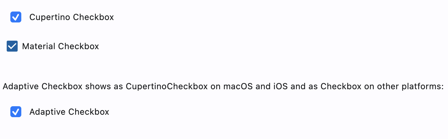
Cupertino, Material and Adaptive Checkboxes#
import flet as ft


def main(page: ft.Page):
    page.add(
        ft.SafeArea(
            content=ft.Column(
                controls=[
                    ft.CupertinoCheckbox(label="Cupertino Checkbox", value=True),
                    ft.Checkbox(label="Material Checkbox", value=True),
                    ft.Container(height=20),
                    ft.Text(
                        value=(
                            "Adaptive Checkbox shows as CupertinoCheckbox on macOS "
                            "and iOS and as Checkbox on other platforms:"
                        )
                    ),
                    ft.Checkbox(
                        adaptive=True,
                        label="Adaptive Checkbox",
                        value=True,
                    ),
                ],
            ),
        )
    )


if __name__ == "__main__":
    ft.run(main)
Styled checkboxes#
import flet as ft


def main(page: ft.Page):
    page.theme_mode = ft.ThemeMode.LIGHT

    page.add(
        ft.SafeArea(
            content=ft.Column(
                controls=[
                    ft.CupertinoCheckbox(
                        label="Cupertino Checkbox tristate",
                        value=True,
                        tristate=True,
                        check_color=ft.Colors.GREY_900,
                        fill_color={
                            ft.ControlState.HOVERED: ft.Colors.PINK_200,
                            ft.ControlState.PRESSED: ft.Colors.LIME_ACCENT_200,
                            ft.ControlState.SELECTED: ft.Colors.DEEP_ORANGE_200,
                            ft.ControlState.DEFAULT: ft.Colors.TEAL_200,
                        },
                    ),
                    ft.CupertinoCheckbox(
                        label="Cupertino Checkbox circle border",
                        value=True,
                        shape=ft.CircleBorder(),
                    ),
                    ft.CupertinoCheckbox(
                        label="Cupertino Checkbox border states",
                        value=True,
                    ),
                    ft.CupertinoCheckbox(
                        label="Cupertino Checkbox label position",
                        value=True,
                        label_position=ft.LabelPosition.LEFT,
                    ),
                ],
            ),
        )
    )


if __name__ == "__main__":
    ft.run(main)
Properties#
class-attribute
instance-attribute
#
active_color: ColorValue | None = ACTIVE_BLUE
The color used to fill checkbox when it is checked/selected.
If fill_color returns a non-null color in the
ControlState.SELECTED state, it will be used instead of this color.
class-attribute
instance-attribute
#
autofocus: bool = False
Whether this checkbox will be selected as the initial focus. If there is more than one control on a page with autofocus set, then the first one added to the page will get focus.
class-attribute
instance-attribute
#
border_side: ControlStateValue[BorderSide] | None = None
Defines the checkbox's border sides in all or specific ControlState states.
Note
Supported states: ControlState.SELECTED,
ControlState.HOVERED, ControlState.DISABLED,
ControlState.FOCUSED, ControlState.PRESSED,
ControlState.ERROR, and ControlState.DEFAULT.
class-attribute
instance-attribute
#
check_color: ColorValue | None = None
The color to use for the check icon when this checkbox is checked.
class-attribute
instance-attribute
#
fill_color: ControlStateValue[ColorValue] | None = None
The color used to fill this checkbox in all or specific ControlState
states.
active_color is used as fallback color when
the checkbox is in the SELECTED state,
CupertinoColors.WHITE at 50% opacity is used as fallback color
when this checkbox is in the DISABLED state, and
CupertinoColors.WHITE otherwise.
Note
Supported states: ControlState.SELECTED,
ControlState.HOVERED, ControlState.DISABLED,
ControlState.FOCUSED, and ControlState.DEFAULT.
class-attribute
instance-attribute
#
focus_color: ColorValue | None = None
The color used for this checkbox's border shadow when it has the input focus.
class-attribute
instance-attribute
#
label: str | None = None
A clickable label to display on the right of this checkbox.
class-attribute
instance-attribute
#
label_position: LabelPosition = RIGHT
Defines on which side of this checkbox the label should be shown.
class-attribute
instance-attribute
#
mouse_cursor: MouseCursor | None = None
The cursor for a mouse pointer entering or hovering over this checkbox.
class-attribute
instance-attribute
#
semantics_label: str | None = None
The semantic label for this checkbox that will be announced by screen readers.
This is announced by assistive technologies (e.g TalkBack/VoiceOver) and not shown on the UI.
class-attribute
instance-attribute
#
shape: OutlinedBorder | None = None
The shape of this checkbox.
Internally defaults to RoundedRectangleBorder(radius=4).
class-attribute
instance-attribute
#
spacing: Number | None = 10
The space between this checkbox and the label.
class-attribute
instance-attribute
#
tristate: bool = False
If True, this checkbox's value can be True, False, or None.
class-attribute
instance-attribute
#
value: bool | None = False
The value of this checkbox.
- If
True, this checkbox is checked. - If
False, this checkbox is unchecked. - If
NoneandtristateisTrue, this checkbox is indeterminate (displayed as a dash).
Events#
class-attribute
instance-attribute
#
on_blur: ControlEventHandler[CupertinoCheckbox] | None = (
    None
)
Called when this checkbox has lost focus.
class-attribute
instance-attribute
#
on_change: ControlEventHandler[CupertinoCheckbox] | None = (
    None
)
Called when the state of this checkbox is changed.
class-attribute
instance-attribute
#
on_focus: ControlEventHandler[CupertinoCheckbox] | None = (
    None
)
Called when this checkbox has received focus.